Material and Finishes
Design considerations and awareness
Children explore and interpret their world in a multisensorial manner. Considering that the materials and finishes used in any space greatly influence our sensory experience, it is critical that the materials and finishes in an ELC setting are carefully chosen in terms of light, reflection, colour, acoustic properties, microclimatic conditions, and tactile effects.
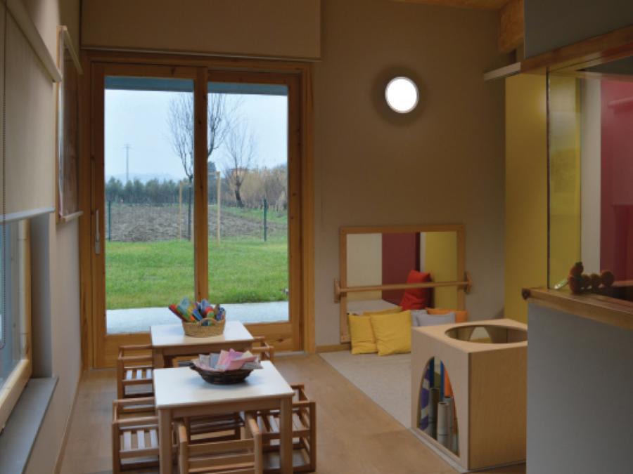
03. Asilo Nido La Chiocciola, San Miniato, Italy
Asilo Nido La Chiocciola, San Miniato, Italy.
Design features
- Natural materials and subtle use of colour creates a calm environment.
Balancing visual stimulation
The materials and finishes in a setting influence the visual environment for all users and in turn impact sensory stimulation, attention and distraction. This is particularly important for young children who naturally experience high levels of distraction and those who are acutely sensitive to their environment.
While many ELC settings are quite colourful and visually busy, a different approach is promoted by approaches such as the Montessori, Reggio Emilia and San Miniato. A more controlled and carefully curated visual environment is a key part of these philosophies. This is supported by research findings showing that multiple displays and materials can distract children, while a visually calmer environment may better support learning. An appropriate level of stimulation is recommended, this avoids the excessive use of bright colours and visual complexity that may overstimulate children.
The appropriate level of stimulation is an important factor when designing for environments supportive of children with autism. The widely held consensus is that a calm, uncluttered and carefully structured environment will provide the sensory-attuned setting a child with autism requires. At the same time, it is important to avoid under stimulation, which research shows can be as negative as overstimulation.
To achieve a balanced approach to visual stimulation, careful attention should be paid to the selection of colours, bright or complex finishes and display materials. This applies to furniture, toys, and indoor and outdoor play equipment. It can be argued that this balanced approach to sensory stimulation reinforces the commonalities rather than the differences between the needs of various children.
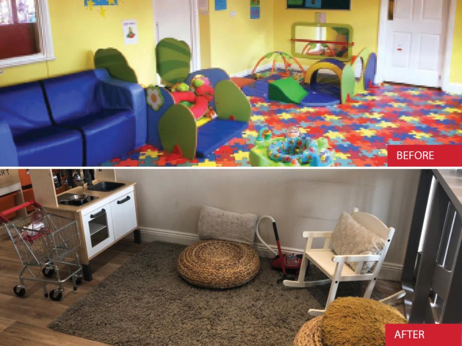
04. High Care Childcare, Ballincollig, County Cork
High Care Childcare, Ballincollig, County Cork.
Design features
- In the before photo there is excessive use of primary colours and distracting patterns. In the after photo, the colours are neutral, patterns are removed, and the atmosphere is calmer and less over-stimulating.
Surface reflectance and patterns
Surface reflectance and the use of patterns or surface designs, both interior and exterior, can have a negative impact on many people. Excessive light reflection due to sunlight or artificial light can be problematic for people who are hyper-sensitive to light. Strong floor patterns or floor finishes with complex designs can also cause distraction, over-stimulation, and spatial confusion for many people.
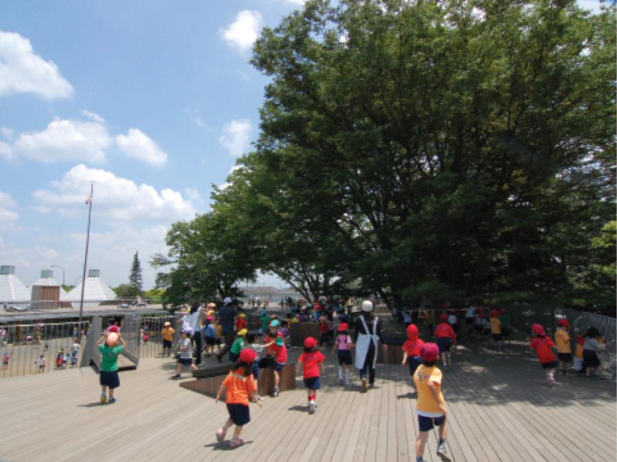
05. Fuji Montessori Kindergarten, Tokyo, Japan
Fuji Montessori Kindergarten, Tokyo, Japan.
Design features
- The ground surface of the roof terrace is finished with natural timber decking that is non-slip, non-glare and non-reflective. This helps to create a calm and visually uncluttered environment.
- The guard rails consist of vertical bars that allow children a good view from the roof deck while not being climbable.
Design tip
- Decking can be become quite slippery when wet and over time and requires regular maintenance to ensure its safety.
Colour
The impact and perception of colour depends on culture, context, gender and various other factors. For people generally, personal colour preference and preferred levels of illuminance have also been found to influence user perceptions of colour. Research regarding the impact of colour on children with autism, for example, varies greatly and has been shown to depend on the child’s preferences. Similarily conditions such as Attention Deficit Hyperactivity Disorder (ADHD) can result in difficulties with visual functions such as depth perception, peripheral vision, and visual processing speed. People with ADHD may also experience colour perception difficulties with blue and yellow colours.
While the exact reason for this is still unclear, deficiencies in the central nervous system associated with ADHD are a possible cause.
For information about autism and ADHD see www.hse.ie/eng/health/az/
A subtle and calm approach to colour: Colour should be used carefully to create a harmonious environment, while stronger accent colours can be used to define certain areas or provide visual cues and identify landmarks. Striking the balance between understimulation and overstimulation is a challenge, but this balance is critical to a supportive environment for children.
06. Mallow Community Childcare, County Cork
Mallow Community Childcare, County Cork.
Design features
- Neutral background colours used on the walls and floor create a calm environment that is punctuated by a limited number of bright colours.
- Windows are fitted with safety restrictors that limit the opening of the window section to 100mm.
07. High Care Childcare, Ballincollig, County Cork
High Care Childcare, Ballincollig, County Cork.
Design features
- Combination of neutral background colours and selected bright colours create a balanced and calm visual environment.
Design tip
- Ensure fabric used in this way is fire repellent.
- Bare concrete walls visible from children’s rooms can be brightened up by painting them, adding planting, or using them as areas that children can draw on with chalk when they are outside.
Colour for wayfinding and orientation: Colour can play an important role in wayfinding and orientation for young children in the ELC environment. The use of distinct colours to create visual landmarks has been shown to help children understand where they are and to find their way around.
The use of colour to create landmarks and visual orientation nodes is also effective for children with autism where hypersensitivity or an inability to understand typical wayfinding symbols may cause disorientation or anxiety. This is particularly relevant in larger settings or settings where children have the freedom to move about independently.
Colour and emotional or physiological impact: There is a lack of consensus regarding the emotional or physiological impact of colour, some experts cautiously suggest the following colour implications for people of all ages.
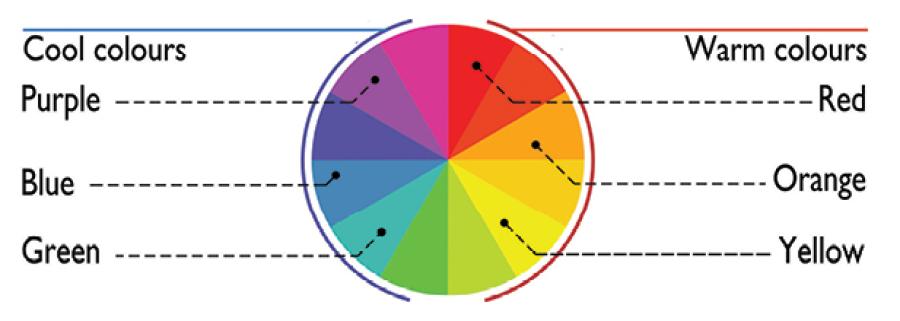
Red is a warm colour, believed to be stimulating. It increases perceived room temperatures and decreases the perceived size of a room (the opposite to blue). The use of red is also linked with higher blood pressure and an increased sense of smell.
Orange is a warm colour, strongly associated with nature and earthiness. It is also associated with cheerfulness and the sun.
Pink has been shown in certain cases to decrease aggression and overall is perceived as a relaxing and calming colour.
Yellow is a highly visible colour with strong communication qualities. It is believed to be a restful colour that increases perceived room size. It is typically associated with clarity, optimism and the sun.
Blue is a cool colour believed to be restful and calming which decreases perceived room temperatures and increases the perceived size of a room. In some cultures, it represents tranquility, wisdom, an awakening or transition to another world or state of mind.
Green is a cool colour believed to be very restful and increases the perceived size of a room. It is also strongly associated with nature, and represents freshness, growth, harmony and balance.
Colour is very subjective, and will be perceived differently depending on age, gender, culture, and contextual influences such as location, lighting conditions, time of day, season, or indeed fashion.
08. Asilo Nido La Chiocciola, San Miniato, Italy
Asilo Nido La Chiocciola, San Miniato, Italy.
Design features
- A calm palette of colours using natural timber, white paint, and a panel of yellow in the background.
09. Beginnings Creche, Mahon, Cork
Beginnings Creche, Mahon, Cork.
Design features
- Neutral background colours combined with a small number of colourful items such as the cushions and rug create a calm but interesting space.
Design tip
- Ensure rugs are secured so they do not present a trip hazard.
Internal surfaces
Floors: Small children spend most of their time on the floor and therefore a suitable floor finish is crucial. Certain areas will require waterproof and anti-slip (at least R10 slip resistance) finishes such as linoleum or vinyl floor covering, while rest areas will require softer, more comforting materials such as soft mats or carpets. Balancing interesting and natural floor finishes with safety, maintenance and cleanability is a challenge and must be carefully considered to ensure materials provide the multisensory qualities critical to the ELC setting. Floor colours and patterns can affect how a person perceives a space. The use of sharp colour or tonal contrast in flooring can be perceived as a step or a hole by people with visual or perceptual difficulties. Blocks of contrasting colour or tone, or the use of strong floor patterns can be misinterpreted as objects on the floor, this can cause a person to step over them or side step, and may result in a fall.
Surface reflectance and patterns have already been discussed on page 226 as a potential source or disorientation and spatial confusion, or distraction and over-stimulation, so these issues must be carefully considered in relation to floor finishes.
10. Ballindereen Community Childcare and Education Centre, Ballinderreen, County Galway
Ballindereen Community Childcare and Education Centre, Ballinderreen, County Galway.
Design features
- Hard wearing, non-slip, and non-glare vinyl floor that avoids patterns.
11. Ballindereen Community Childcare and Education Centre, Ballinderreen, County Galway
Ballindereen Community Childcare and Education Centre, Ballinderreen, County Galway.
Design features
- Soft carpet used to create a cosy seating corner for reading or relaxing.
- This space is at a mezzanine level, so gives children a different view to the outside space.
Internal walls: In a similar way to floors, the lower sections of walls are an important part of a child’s environment and must strike a balance between sensory stimulation, safety and maintenance. Walls provide the main display area in the ELC setting and should be constructed and finished with robust materials to handle a high level of wear and tear. While display boards will provide dedicated areas for mounting various artwork and photographs all walls should take art creations of some sort. Walls should be painted in a wipe-clean finish. Use contrasting colours on walls, skirting boards and architrave to make the difference between doors, walls and floors visible. Blackboard paint can be used in some areas, so children can draw on this surface.
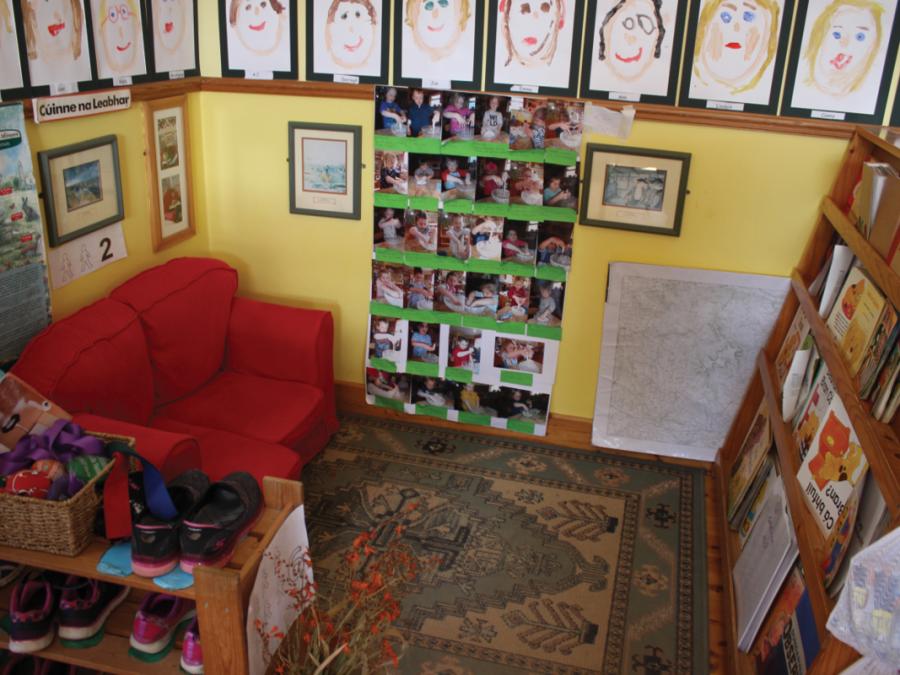
12. Naíonra Choill Mhic Thomasín, County Waterford
Naíonra Choill Mhic Thomasín, County Waterford.
Design features
- Walls used to pin up various artwork and photographs of the children.
- Sofa, bookshelf, and carpet used to create a cosy corner.
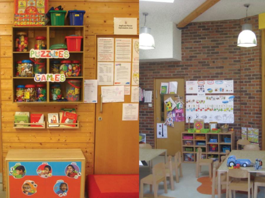
13. Northside Family Resource Centre, Ballynanty, Limerick City
Northside Family Resource Centre, Ballynanty, Limerick City.
Design features
- A mix of materials used on internal walls including timber cladding (left) and brick (right) provide variety and visual interest within the setting.
- Distinct internal finishes can be used to create a sense of place and distinguish one room or space from another. This can help to orientate people within the setting and aid wayfinding.
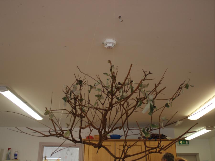
14. Cheeky Cherubs, Ballincollig, County Cork
Cheeky Cherubs, Ballincollig, County Cork.
Design features
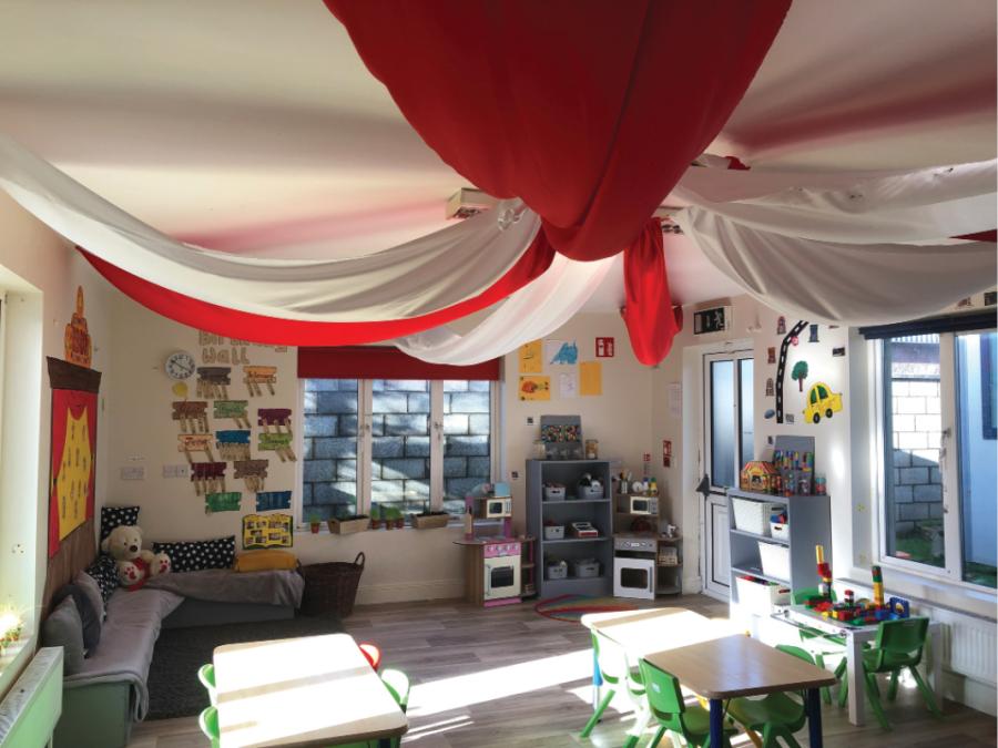
- A tree branch hanging from the ceiling. This demonstrates the various elements that may get suspended from ceilings within a typical setting.
Design tip
- For features like this which may be a fire hazard, treat with fire retardant, clear intumescent paint or similar.
Ceilings: The ceiling within the early years setting should be of a colour that creates a sense of space, is easily maintained, and constructed using materials that will support hanging mobiles and other objects. It is important not to suspend too many materials from the ceiling, to avoid over-stimulation. Materials suspended from the ceiling must be fire retardant.
Universal Design Guidance
- Floor surfaces should reflect the activity in that area (waterproof for messy work or art areas, calm or cosy finishes using carpet or similar soft material for quiet area).
- Floor finishes should be non-slip (at least R10 slip resistance), non-glare materials that avoid strong patterns and sharp tonal or colour contrast.
- All walls should be constructed and finished with robust materials to handle a high level of wear and tear. Provide load bearing wall structures: such as blockwork or double stud partitions in strategic locations to allow fixing of handrails, shelves or other elements if required.
- Use ceiling materials that will support hanging mobiles and other objects. Where suspended ceilings are used the metal frame can help in this regard. In other situations, consider load bearing ceiling structures in strategic locations to allow fixing of hoists, hanging toys or mobiles, or other elements if required.
- Materials suspended from the ceiling must be fire retardant.