Signage
Design considerations and awareness
Wayfinding is a collective term that describes the features in a building or environment that help with orientation and navigation. Signage plays a big part in helping a person to find their way to the setting, locate the entrance, and then navigate around inside the building.
Due to the small size of many ELC settings and the level of familiarity that many users will have with the environment, wayfinding will not always be a concern. However, there are users who might visit infrequently such as prospective families, new staff and delivery drivers or those with sensory, physical or cognitive difficulties that will benefit from well placed, legible and easily understood wayfinding signage.
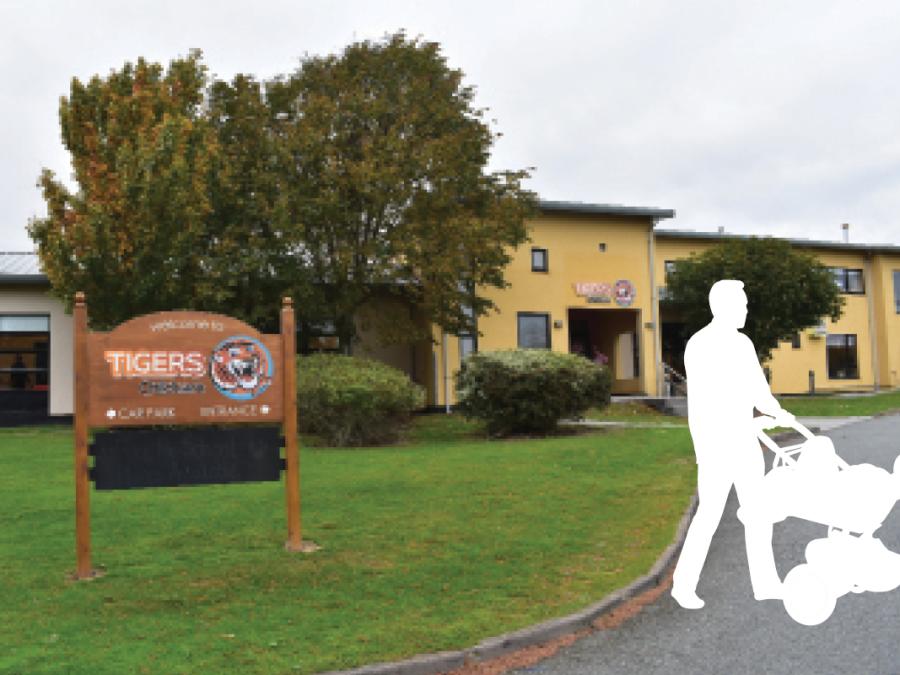
28. Tigers Childcare, Blanchardstown, Dublin
Tigers Childcare, Blanchardstown, Dublin.
Design features
- Good wayfinding signage at the site entrance informs a person about the location of parking and the main entrance to the building.
- Signage over the main entrance door continues the wayfinding and guides a person into the setting.
Design tip
- Increasing the size of the arrows will make the sign more useful for people.
- Adding a light above the sign would increase visibility in low light conditions.
Types of signage: Four types of signage are typically required in buildings including: Information signs; directional signs; identification signs; mandatory signs. It is helpful to take a consistent approach across these categories so that each type of sign has the same appearance. This will help a person identify signs and understand that one sign tells you that you have arrived at your destination (i.e. identification signs).
Signage colour: Consistent visuals for each and all categories of signage will help ELC users identify the kind of signage they are looking at. For signage legibility the contrast between the signboard and the colour of the text is important. Contrast is determined by the Light Reflectance Value (LRV) of each colour, and is measured between 0 and 100, where a high LRV results in a bright colour, while a low LRV results in a darker colour. For good colour contrast there must be an LRV contrast of at least 70% between the text and the background colour.
Surface Finish: The surface finish of the signage should be non-glossy or non-reflective so as not to cause difficulties for those with sensory, physical or cognitive challenges. For signage, font and size, Sans serif display typefaces such as Arial or Futura are considered highly legible, while letter size on signage is determined by the appropriate viewing distance. In terms of letters and spelling, legibility will be improved by capitalising the first letter of names and locations while using lower-case for all other letters.
Language and terminology: The use of simple, easily understood language and terminology will help with wayfinding and this will be reinforced by clearly associated symbols or icons.
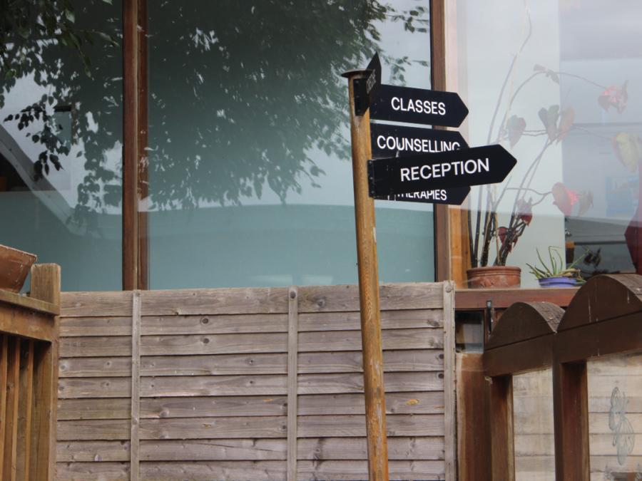
29. Beginnings Creche, Mahon, Cork
Beginnings Creche, Mahon, Cork.
Design features
- Post mounted signage providing direction to key parts of the setting.
- Good colour contrast between the lettering and the sign board make the signage clearly visible.
Design tip
- Signage legibility is helped by use of upper and lower case letttering.
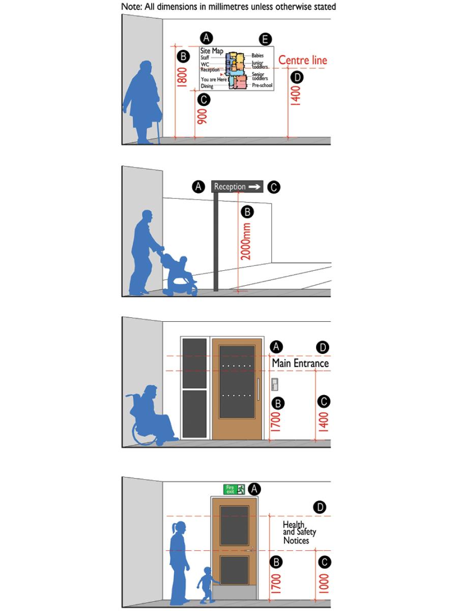
Technical sketch 5: Four types of typical signage
01 - Information signs
A. The example shown here is a floor plan map.
B. Top of map is 1800mm above floor level.
C. Bottom of map is 900mm above floor level.
D. Map is centred at 1400mm above floor level.
E Large format text with good colour contrast to the background.
02 - Directional signs
A. The example shown here is a directional signpost.
B. Bottom of sign is 2000mm above floor level.
C. Large format text and arrow with good colour contrast to the background.
03 - Identification signs
A. The example shown here is a building entrance identification sign.
B. Top of sign is 1700mm above floor level.
C. Bottom of sign is 1400mm above floor level.
D. Large format text with good colour contrast to the background.
04 - Mandatory signs
A. This example shows an Emergency exit sign and location of possible health and safety notices.
B. Top of health and safety notices 1700mm above floor level.
C. Bottom of health and safety notices 1400mm above floor level.
D. Large format text with good colour contrast to the background.
All signage
Careful use of signage will avoid visual clutter and confusion. Signage should use simple language and simpler and recognisable symbols to provide clear wayfinding for all users in the setting.
Universal Design Guidance
- Directional signs and room identification signs for close range viewing should be 1400-1700mm above floor level. Embossed signs to be positioned where a person can approach and touch the sign without being obstructed or causing an obstruction to other people.
- Wall-mounted signs should not project more than 100mm from the wall surface. These signs should be mounted on the wall adjacent to the leading edge of the room door rather than on the door face so that they are always visible and to ensure that the door is not opened while someone is reading the signage.
- Detailed maps, diagrams, and timetables should be centred at 1400mm above floor level, with the lower edge no lower than 900mm and the upper edge no higher than 1800mm above floor level.
- Directional or identification signage requiring medium-range viewing should be based on the following:
- Suspended signs: 2300mm clear headroom to the underside of the sign.
- Post-mounted signs: Located at least 2000mm above floor level.
- Directional or identification signage for large spaces that require long-range viewing and that may be obscured by people, should be placed at least 2300mm above floor level.
- Consider Sans serif display typefaces such as Arial or Futura or similar typefaces that are highly legible.
- Ensure good colour contrast between signage text and the sign board or background surface. This should have an LRV contrast of at least 70%. For more information on visual contrast and LRV see section Visual Contrast in Building for Everyone - Booklet 4 – Internal environment and services.
- Signage font height is determined by the distance at which the signage will typically be viewed:
| Viewing distance | Font height |
|---|---|
| 6000mm | 200mm |
| 4600mm | 150mm |
| 2500mm | 100mm |
| 1500mm | 50mm |